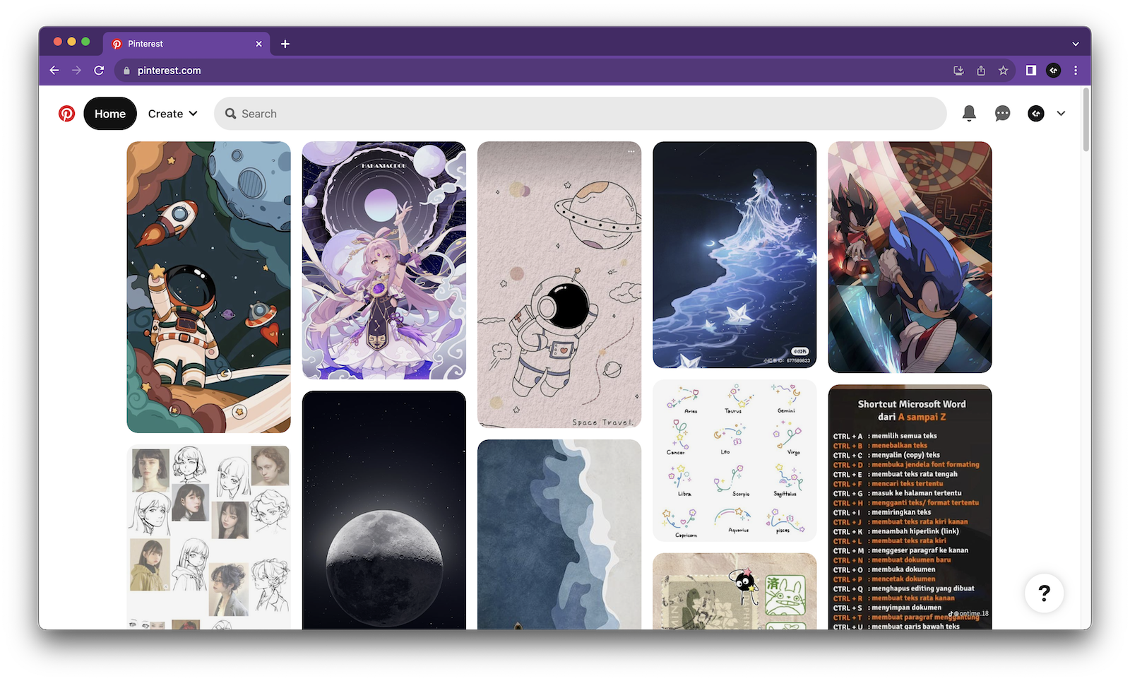
Masonry layout is a popular and flexible grid-based layout design. Unlike traditional grids, where elements in the same row have the same height, elements are placed within columns but can have varying heights, resulting in a more organic and visually interesting arrangement.
Such a layout uses space efficiently as it fills up most of the available screen real estate with its contents and leaves little white space between elements. It is commonly used for presenting user-generated media like images and GIFs. The most famous site with this layout is Pinterest.
Question
Design the Pinterest homepage, with a focus on the masonry layout.
Pinterest front end system design questions are commonly asked in two manners:
- Design the Pinterest homepage, which covers page architecture, masonry layout, data fetching, etc.
- Design a masonry component, discussing the props, layout approach, etc.
We will focus on the former but also provide enough content and guidance for the latter. In fact, the actual masonry component Pinterest uses on their homepage is built in React and open sourced! You can dive into the source code to learn the ins and outs of the component and also use it on your own sites.
Pinterest is essentially an image feed with a multi-column layout. Hence, it shares many similarities with the News Feed system design and Instagram system design. Please read through those questions before starting on this one. For this question, the discussion will be centered around the masonry layout and less about general feed optimizations.