Top Headless UI libraries for React in 2026
Explore some of the best headless UI libraries for React in 2026.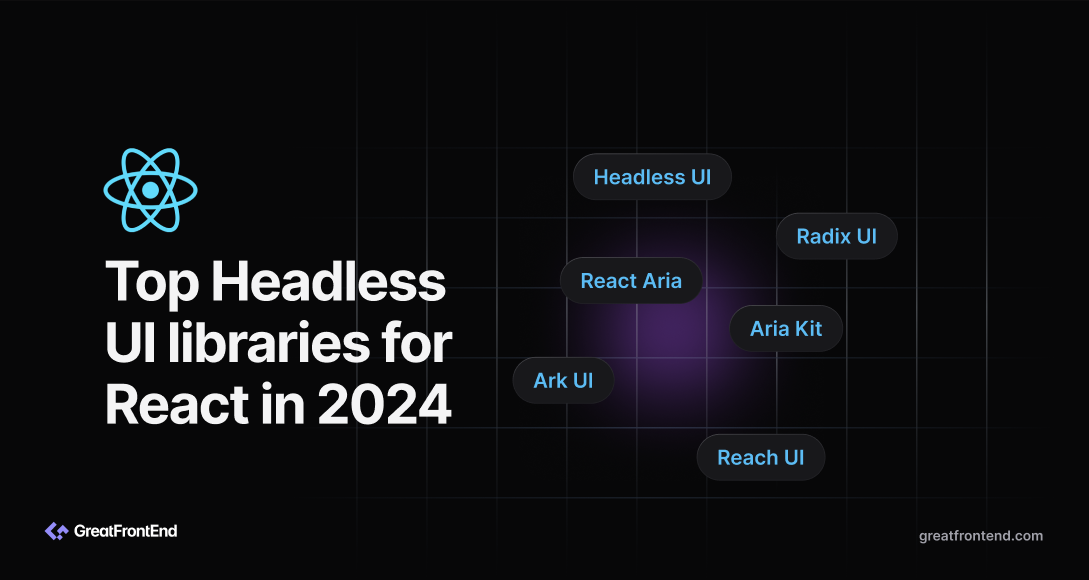
Headless UI libraries handle the logic, accessibility, and interaction behavior of UI components but leave the styling to you. You bring your own styles or design system, and the library handles keyboard navigation, focus management, ARIA semantics, RTL support, and controlled vs uncontrolled state.
A couple of things have shifted since 2024:
- Radix UI was acquired by WorkOS and updates have slowed for some components. Base UI (maintained by MUI) is now the more actively maintained primitive layer.
- shadcn/ui has become the most common way teams consume Radix or Base UI primitives in production. It isn't strictly headless since it ships with Tailwind styles, but we cover it at the end since it sits on top of the headless layer.
The libraries below are ordered by npm weekly downloads, with shadcn/ui covered last.
Understanding the layers
These libraries don't all sit at the same layer of your stack:
- Primitive layer: accessible, unstyled, low-level components you compose into your own UI. Examples: Radix UI, Base UI, React Aria, Aria Kit.
- Component layer: pre-built combinations of primitives. Examples: Headless UI (its own primitives, designed for Tailwind), shadcn/ui (Radix or Base UI primitives plus Tailwind styles, copied into your repo).
- Cross-framework primitive layer: the same accessibility and state-machine logic but available beyond React. Example: Ark UI (React, Vue, Solid).
Picking shadcn/ui doesn't mean skipping the primitive layer. Radix UI (or Base UI, since 2025) still lives in your node_modules underneath your components/ui/ folder. Picking React Aria means writing more code per component, but it gives you the deepest accessibility primitives available.
Headless UI
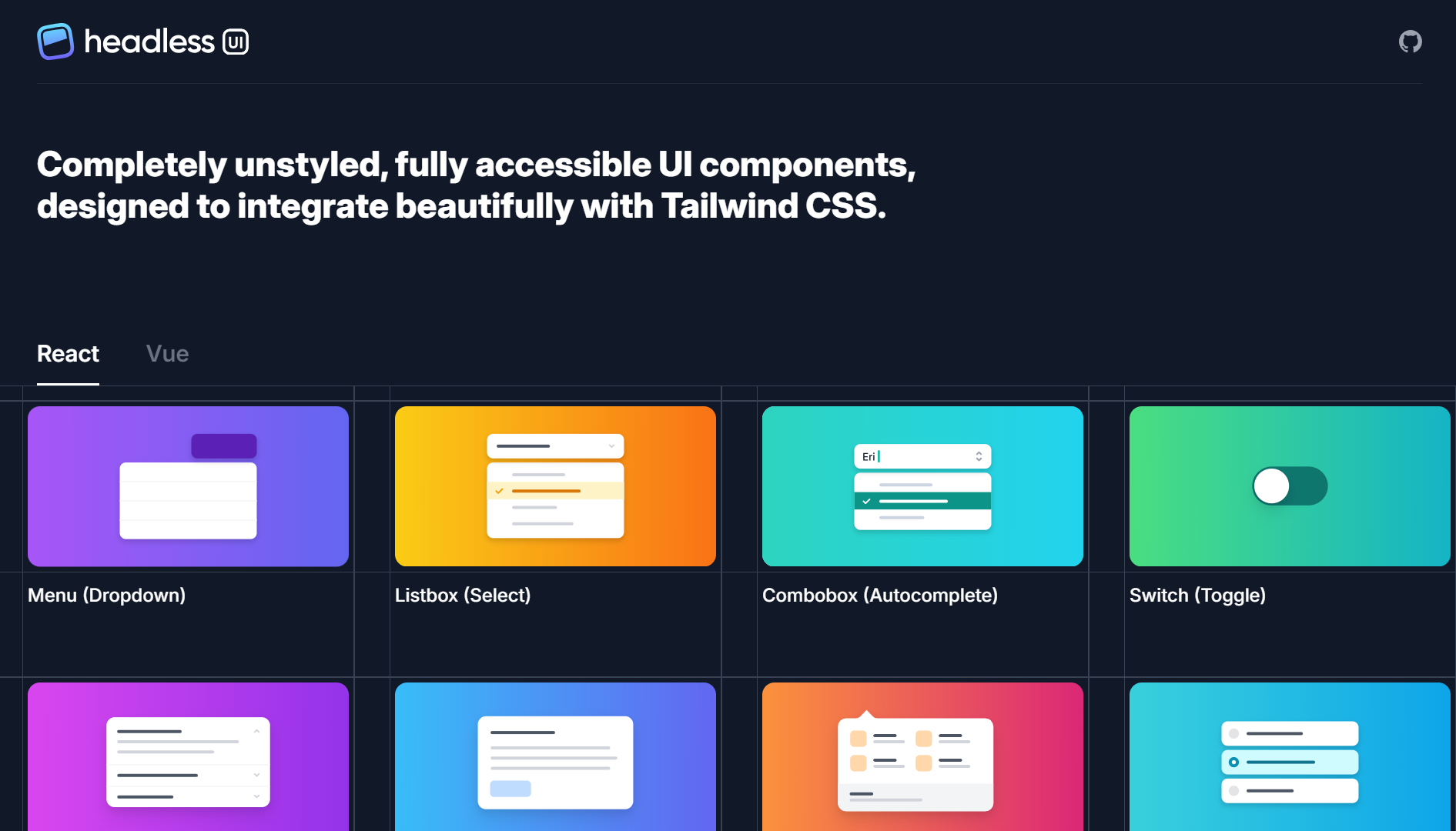
Headless UI is built by the Tailwind CSS team. It's a small set of unstyled, accessible components designed to compose with Tailwind utilities. The component count is intentionally small (~10 components) and the API is the most beginner-friendly in this list.
By the numbers (as of May 2026):
- GitHub stars: ~28.6k
- Npm weekly downloads (
@headlessui/react): ~5.49M - No. of components: ~10
Best for: Tailwind-first teams that want a familiar, opinionated API and don't need the composability of Radix-style primitives.
Skip if: You need components beyond what's covered (no Combobox-with-virtualization, no advanced data table primitives), or you want more composability. Radix and Base UI both expose more primitives.
React Aria
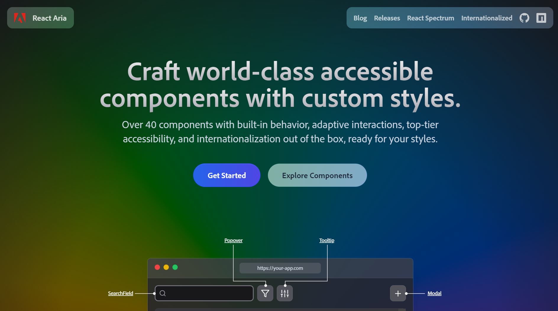
React Aria by Adobe is the most accessibility-rigorous option in this list. It's a library of React Hooks (rather than components) that handle behavior, ARIA semantics, internationalization, and adaptive interactions across 40+ component patterns.
You compose hooks (useButton, useDialog, useTabs) into your own components, which means more code per component but more control over the rendered output. Worth the investment when accessibility is a hard requirement.
By the numbers (as of May 2026):
- GitHub stars (adobe/react-spectrum): ~15.1k
- Npm weekly downloads (
react-aria): ~4.47M - No. of components: 40+ patterns
Best for: Government, enterprise, or any product where WAI-ARIA conformance is contractually required. Also when you need internationalization (RTL, locale-aware date/number components) out of the box.
Skip if: You're shipping a v0 product and want pre-built components. React Aria's hooks-first model is more verbose than Radix or Base UI.
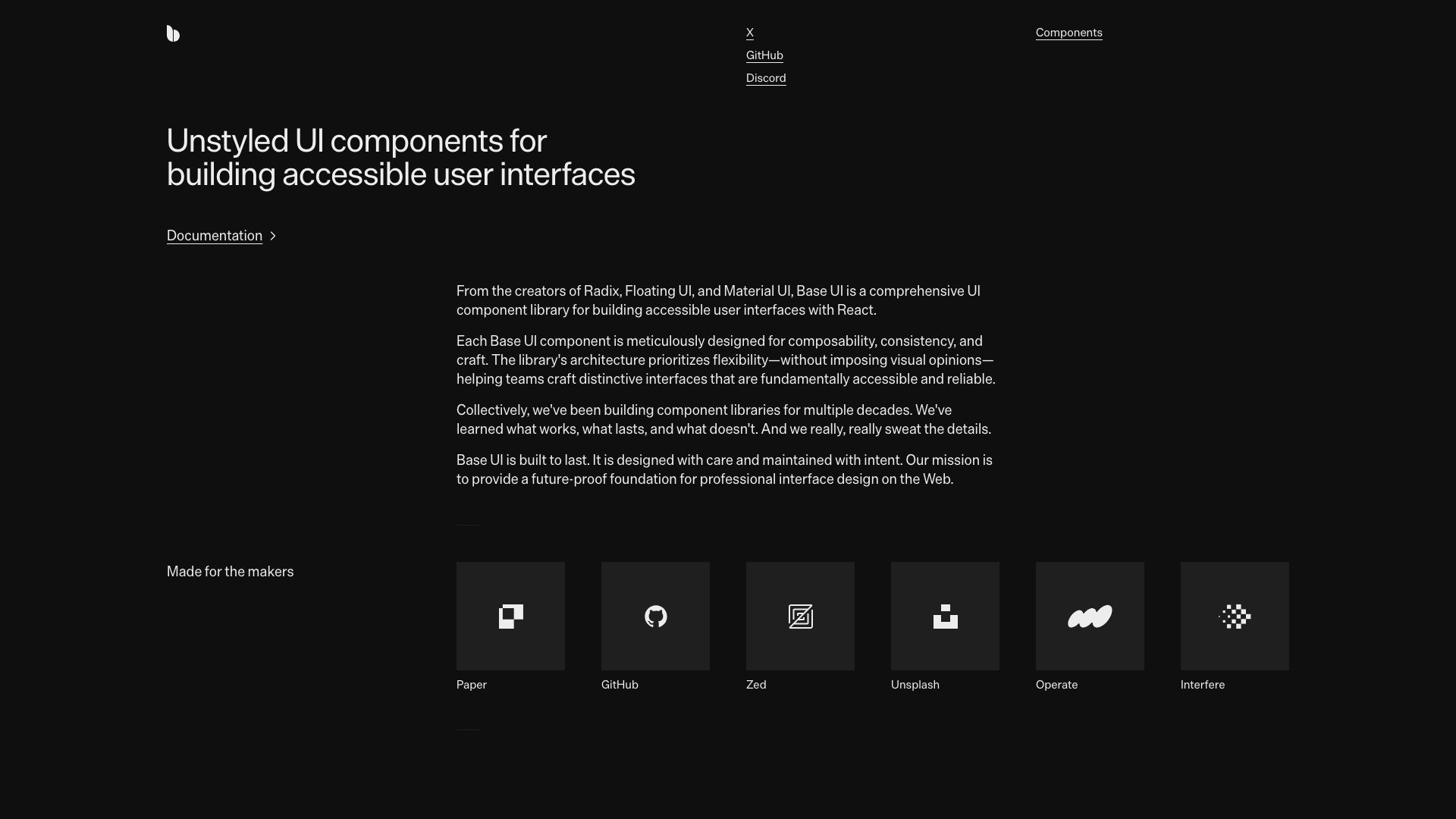
Radix UI
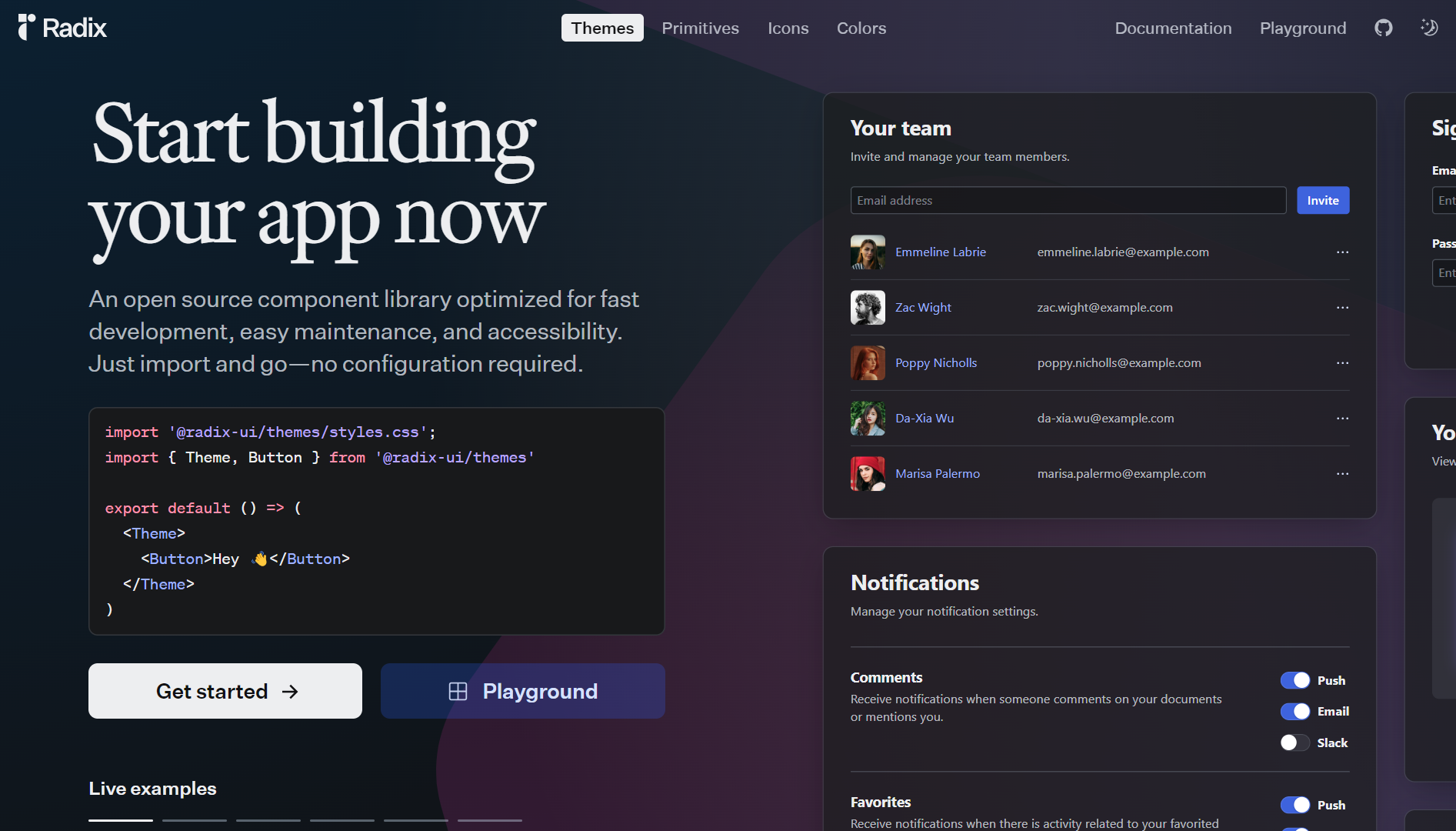
Radix UI is the original primitive library that popularized headless components in React. It provides 30+ unstyled, accessible components (Dialog, Dropdown, Tabs, Popover, etc.) with full keyboard navigation, focus management, ARIA, and RTL support built in.
Radix UI was acquired by WorkOS, and update velocity has slowed for some complex components (Combobox and multi-select being the ones commonly cited). The primitives still see heavy usage through shadcn/ui. @radix-ui/react-slot alone pulls ~131M weekly npm downloads as of mid-2026.
By the numbers (as of May 2026):
- GitHub stars: ~18.8k
- Npm weekly downloads: ~4.4M
- No. of components: 30+
Best for: When you want pre-built accessible primitives without the copy-paste of shadcn/ui, and you already have your own styling solution (CSS Modules, Emotion, vanilla CSS, etc.).
Skip if: You need brand-new primitives that haven't shipped yet. Base UI is iterating faster on those.
Base UI
Base UI is the actively maintained alternative to Radix for the primitive layer. Maintained by MUI with full-time engineers, it provides similar headless primitives with a slightly different API.
shadcn/ui added Base UI as a supported primitive layer in 2025, so you can now choose between Radix-backed and Base UI-backed shadcn components.
By the numbers (as of May 2026):
- GitHub stars: ~9.5k
- Npm weekly downloads (
@base-ui/react): ~3.7M - No. of components: 25+ and growing
Best for: Greenfield projects where you want the most actively maintained primitive layer, or anyone who hit Radix limitations on a complex component (Combobox, multi-select).
Skip if: You're already deep in a Radix codebase and migration cost is high. Radix still works, it just isn't moving as fast.
Aria Kit
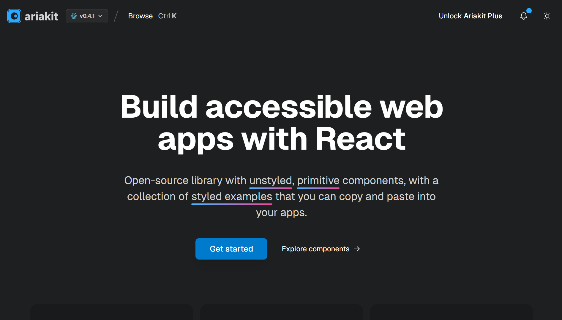
Aria Kit is an open-source library of unstyled, primitive components and hooks for accessible web apps. It ships smaller bundles than most for what you get, with an API that sits between Radix's component composition and React Aria's hooks-first style.
By the numbers (as of May 2026):
- GitHub stars: ~8.6k
- Npm weekly downloads (
@ariakit/react): ~697.9k - No. of components: 25+
Best for: When bundle size matters more than ecosystem familiarity. Often picked by component library authors building their own libraries on top of a primitive layer.
Skip if: You want the largest community and Stack Overflow surface area. Aria Kit is smaller than Radix and React Aria.
Ark UI
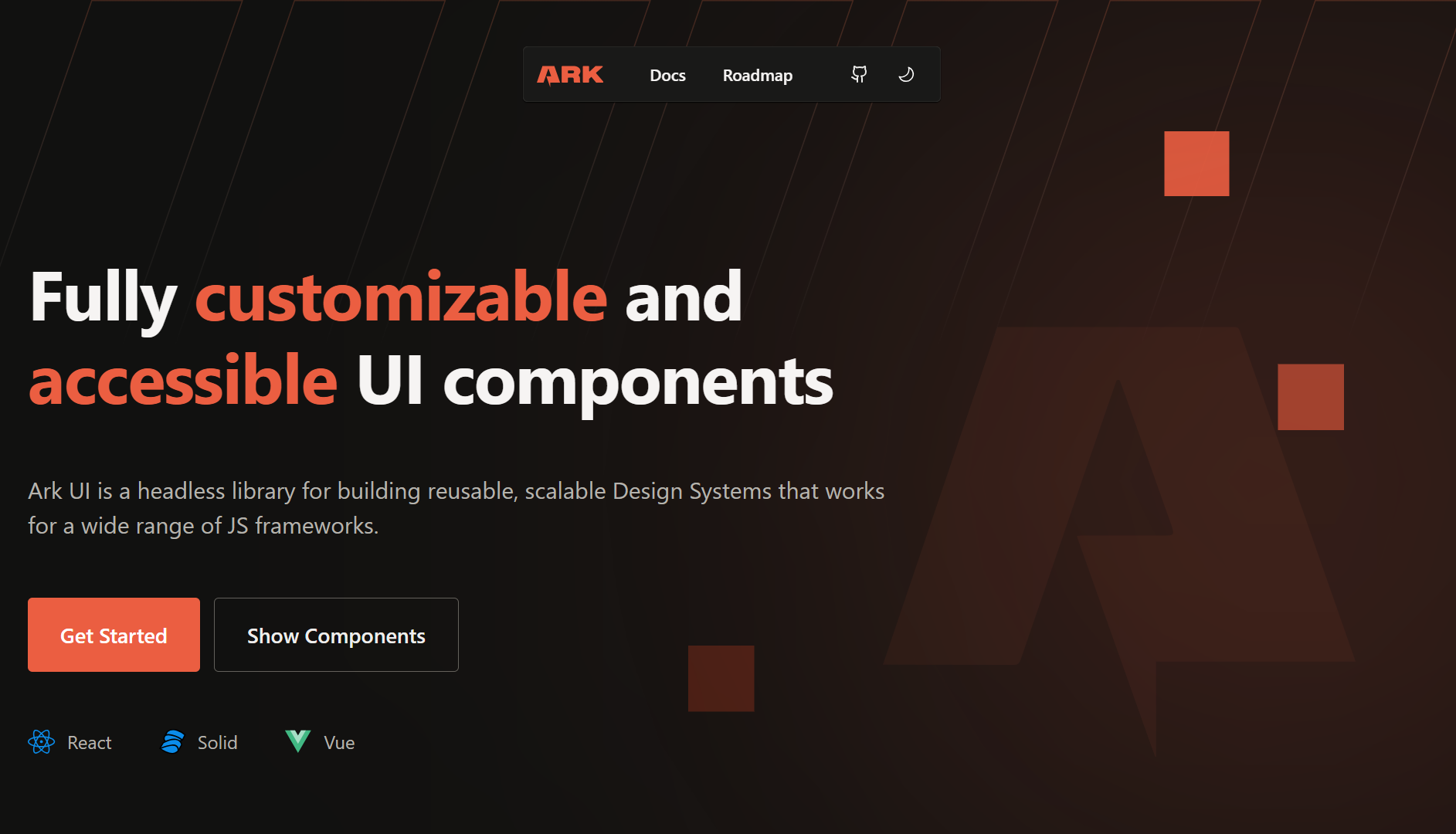
Ark UI is unique in this list: same headless primitive philosophy, but the components work across React, Vue, and Solid. The internal logic is built with state machines (XState) for predictable behavior on complex components.
By the numbers (as of May 2026):
- GitHub stars: ~5.2k
- Npm weekly downloads (
@ark-ui/react): ~634.7k - No. of components: 35+
Best for: Multi-framework design systems where you need the same Combobox behavior in a React app and a Vue app and want to maintain one logic implementation.
Skip if: You're React-only. The React-specific options above usually have more idiomatic React APIs.
shadcn/ui (the dominant consumer of headless primitives)
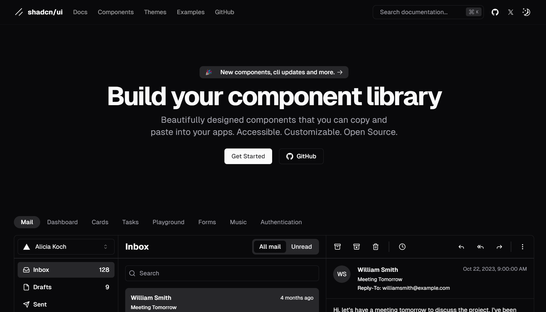
shadcn/ui isn't strictly a headless library since its components ship with Tailwind styles applied. We're including it because it's how most teams now consume Radix or Base UI primitives in production.
It's a CLI that copies pre-built component source code into your project. The components are built on Radix UI primitives by default (with Base UI as an opt-in alternative since 2025) and styled with Tailwind CSS.
The mental model is different from a typical npm package:
- You don't
npm install shadcn-uiand import components. - You run
npx shadcn add buttonand the source code for the Button component is added to your repo atcomponents/ui/button.tsx. - You own and edit that code. There's no version to bump, no breaking change to manage.
You trade dependency management for full control over the code, including the option to strip the Tailwind classes and treat the underlying Radix or Base UI layer as truly headless. That trade-off is why it has taken over so much of the React UI ecosystem.
By the numbers (as of May 2026):
- GitHub stars: ~113.6k (the highest of any library in this guide)
- Npm weekly downloads (shadcn CLI): ~3.87M
- No. of components: 50+ (registry, configurable)
Best for: New product apps where you want full design control on top of headless primitives without writing accessibility logic from scratch, especially if you're already using Tailwind.
Skip if: You can't use Tailwind, want a strictly headless library, or want a published library you can npm update (you don't get that with shadcn/ui).
Any of the libraries above can be used to ship an accessible, maintainable app. Pick the one that matches your styling preferences and how much code you're willing to write per component.
Want to solidify your React foundation while exploring UI libraries like these? Check out our Top ReactJS Interview Questions GitHub repo with 50 frequently asked questions to help you prepare for projects and interviews.