User Interface Components at Scale
How thousands of engineers at big tech companies build user interface components.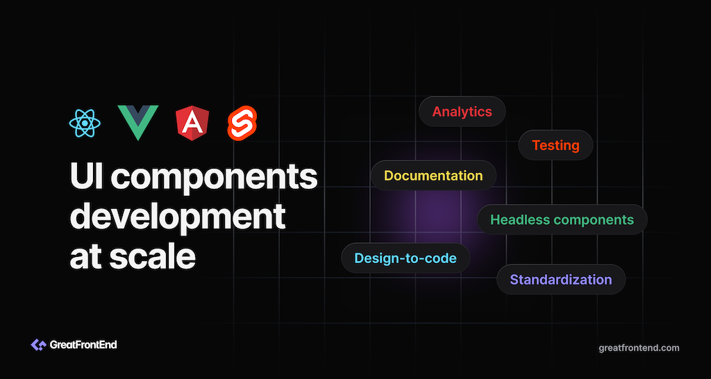
Now that we know how Meta writes JavaScript and CSS, let's see how they're used to build UI components.
Standardize on a UI library/framework
Naturally the company that created React will build all their applications using React. You won't find Angular, Vue, or Svelte in Meta's codebase and Meta is all-in on React. By focusing on a single UI framework, tooling, knowledge and expertise can be shared and transferred more easily. Moreover, any issues faced by Meta engineers can be solved in-house, by consulting the React team. Longer term larger issues can be addressed in React's roadmap.
Component documentation
To easily build and test React components, Meta engineers can write example files for these components to demonstrate how the component looks and behaves when using a certain combination of props, similar to stories in Storybook.
All React components in the codebase that have example files are easily searchable within an internal tool and can be interacted with right within the browser. It is super handy for discovering common components and seeing how they are being used.
Testing
Unit testing of component interaction and behavior can be done using Jest and React Testing Library. Snapshot tests and screenshot tests can also be conveniently generated from the component examples.
Headless components
Each product Meta builds has its own design system with a React implementation of the UI components. Many UI components (e.g. buttons, dropdowns, modals, etc) have the same underlying logic, functionality, and accessibility features built in and that layer can be shared between UI components belonging to different design systems. Each design system only has to care about customizing the appearance. This shared logic and accessibility layer is known as headless UI components. Naturally, Meta has built its own headless components to be reused across product design systems.
Companies looking to accelerate their UI components development should pick up one of the popular headless UI component libraries. For React, there's Radix UI, React Aria, and Aria Kit.
Component analytics
Meta also has internal tools to gain insights on how big a component's file size is (bytes) and analytics, e.g. which modules are depending on the component (importing the component) and how many times they are being used in the codebase. This is useful for tracking progress when deprecating components.
Monorepo perils
In a monorepo, it becomes too easy to import components from anywhere in the codebase. However, this is bad when a component is still under development and not ready to be used widely or when a component is meant to be deprecated. To prevent unwarranted usage of components, lint rules can be used to flag usages of the components outside of directories they are not allowed to be used in.
Design-to-code
An emerging technology trend / workflow is “Design to code”, meaning you turn designs from your designer into code that you can use directly within your app. Since Figma is the industry standard for designing digital products these days, a forward-looking styling approach will be one that's integrated with Figma and can support exporting of UI markup and styles from Figma designs. Companies like Builder.io and Locofy offer such solutions.
Conclusion
Over the years, new UI libraries offering different reactive approaches have emerged (e.g. Qwik and Solid). React may no longer be the most performant library, but in terms of the overall ecosystem, learning resources, financial backing, availability of developers proficient in it, React is still one of the safest choices. Moreover, React is still constantly innovating and improving, with projects like React Server Components and an optimizing compiler. However, it is more important to decide on a company-wide blessed framework that the team is comfortable with, than to choose the most trendy UI framework.
For component examples and visual testing, Chromatic (by the maintainers of Storybook) and Percy are the leading choices available in the market.
UI components scalability checklist
- Company-wide recommendation for UI framework/library (e.g. React, Vue, Angular, Svelte)
- Documentation of components
- Testing of components (unit, screenshot, accessibility)
- Use a headless UI component library
- Component analytics
- Design-to-code (optional)