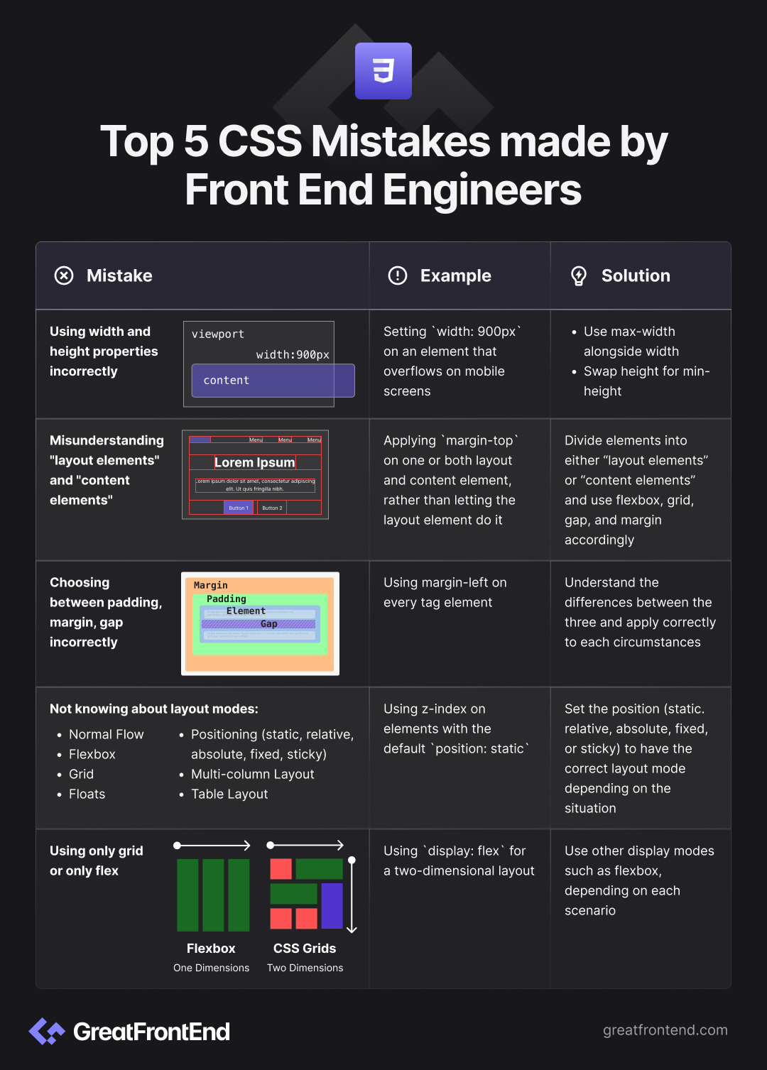
Top 5 CSS Mistakes made by Front End Engineers
5 most common CSS mistakes Front End Engineers make and how to avoid them.
This is a guest post by Jordan Cutler, Senior Frontend Engineer at Pinterest and author of the High Growth Engineer Newsletter.
I've seen a lot of CSS.
Unfortunately, there aren't great resources on doing it right.
In my experience as a Senior Frontend Engineer, I see 5 common mistakes that I'll go over in this article and how to avoid them.
Recognizing and avoiding these mistakes will help you write CSS that:
- Works across devices—not just your laptop
- Works the first time you try it
- Makes you less frustrated with CSS
Let's dive in!
Mistake 1: Using width and height properties incorrectly
One of the most common mistakes comes at the cost of responsiveness.
It's the overuse of width and height.
Luckily, there are easy fixes to this.
In general:
- Use
max-widthalongsidewidth - Swap
heightformin-height
Using width and height can be ok in certain scenarios. If you are using them, you should know what you're doing and be cautious.
Some examples where width and height make more sense:
- An icon that should only be displayed at a particular fixed size.
- A fixed element on the page, like a sticky nav, footer, or sidebar.
- A set of elements that you want to become scrollable if the screen is too small by also setting
overflow: autoon their parent.
HTML is responsive by default. Our CSS is what often breaks the responsiveness. When we add styles, we need to keep our page responsive.
Using width and height is dangerous because they are restrictive.
It says: "You must be this size no matter what."
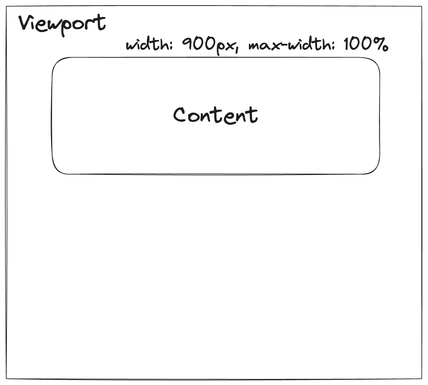
For example: If we use width: 900px on an element, what happens if we are on mobile?
It would overflow off the screen.
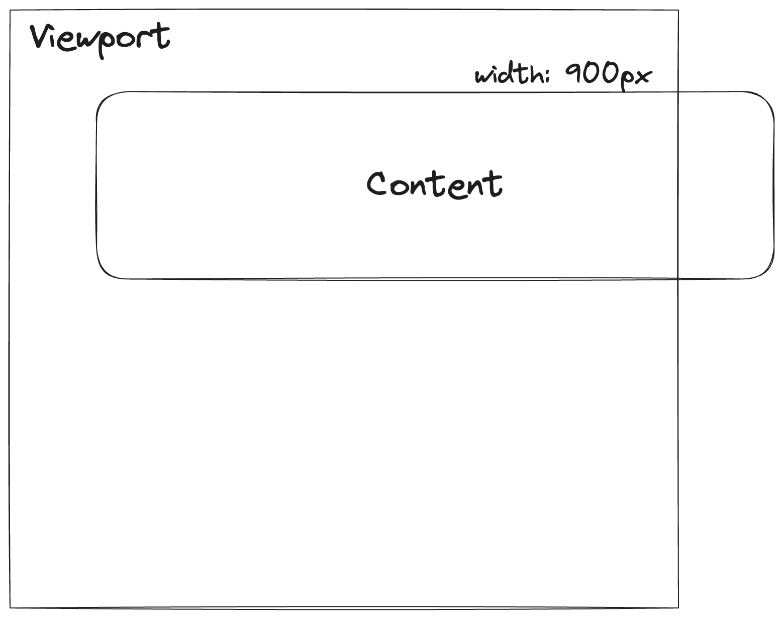
If you do need to use a fixed width value, make it flexible. My preferred way for doing that is adding max-width: 100% .
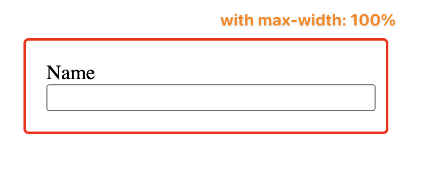
A common example I see in the real world is defining a fixed width value on <input> elements.
Here's what it looks like when an <input> is 400px inside a container that was shrunk to 250px.
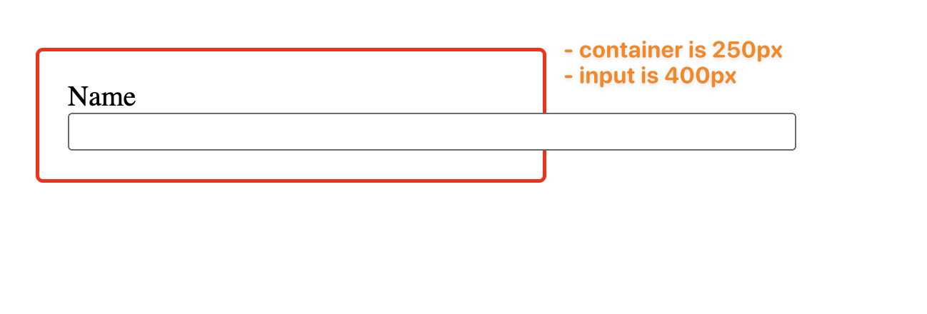
Once we apply max-width: 100% the issue goes away.
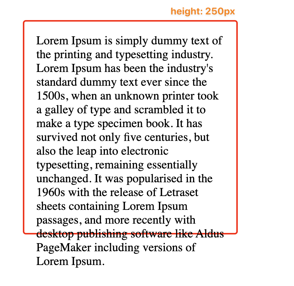
Similarly, we run into the same issue with height.
If we define a fixed height: 250px and our content size is greater than 250px, we see this happen:
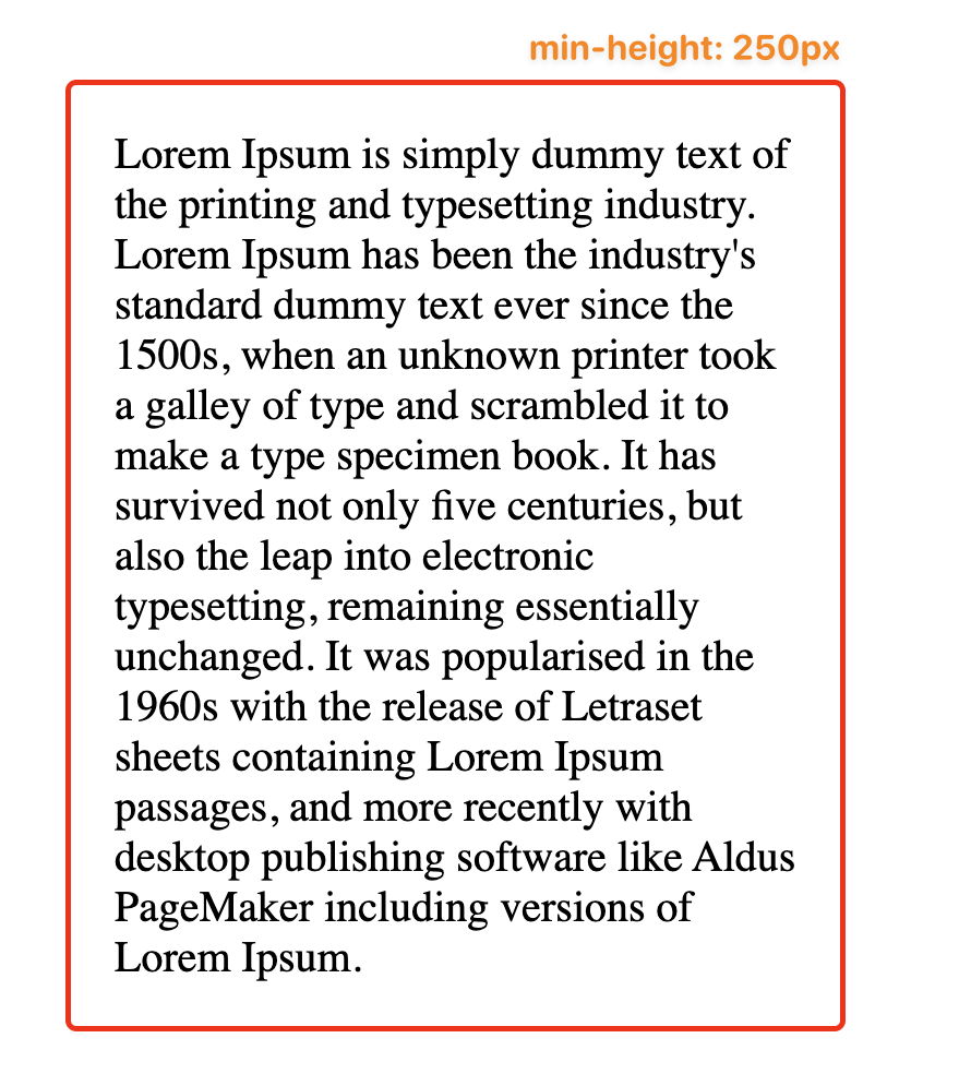
However, the fix is easy. We can use min-height: 250px instead.
Now, our container will always be at least 250px, but can become larger if it needs to fit the content inside.
Mistake 2: Misunderstanding "layout elements" and "content elements"
CSS is often considered difficult to maintain.
A large reason for this is mixing responsibilities in CSS.
In the same way that you don't want a function to be doing 10 different things, we can apply that principle to our CSS.
How? By dividing each element we apply CSS to into either a "layout element" or a "content element."
Here are examples of content elements:
- A button
- A text input
- A paragraph
- A link in the navbar
- A card
Essentially, they are isolated items that hold content.
In comparison, "layout elements" define the layout those "content elements" should be placed in.
They define the structure via flexbox, grid, gap, and margin.
Layout elements are all the elements you don't see.
Here's an example:
Let's look at the Tailwind landing page and see how it is structured by adding a border: 1px solid red to everything.
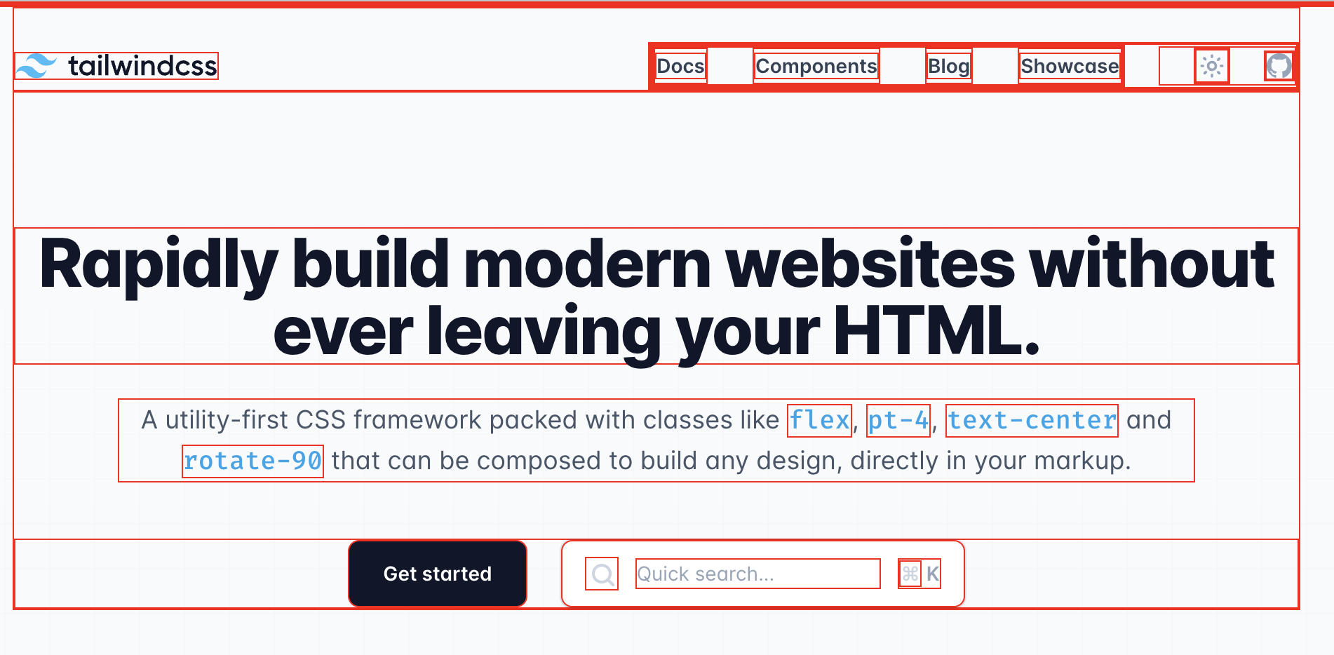
You can already start to see where the "content" elements are vs the "layout elements." The content elements are the buttons, text inputs, paragraph text, icon buttons in the navbar, etc.
Let's focus on the bottom row with the "Get started" button:
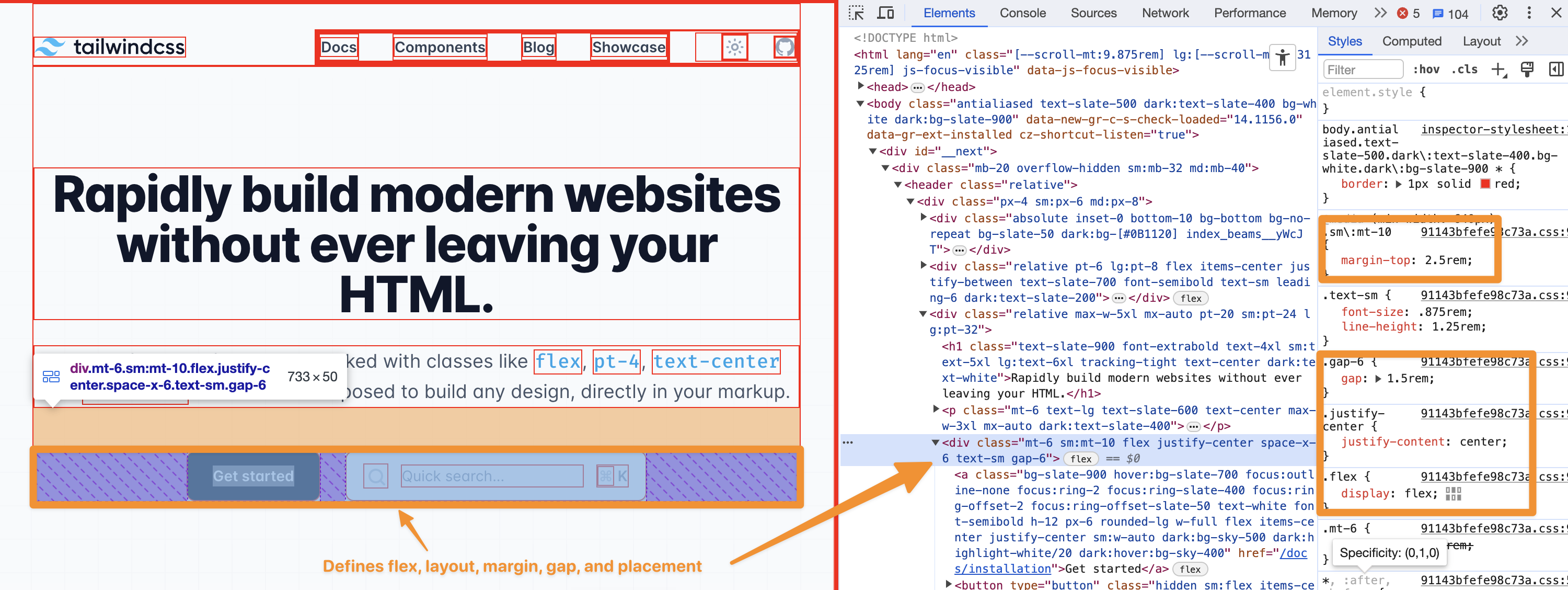
The "Get started" button and "Quick search" input are wrapped in a <div> which is the layout element.
It defines display: flex, margin-top, and justify-content: center.
With that, it created the skeleton where content elements can just be plopped into the correct location.
In your CSS, you should aim to use this pattern too.
A common mistake would be applying margin-top on one or both of these buttons, rather than letting the layout element do it.
Mistake 3: Choosing between padding, margin, gap incorrectly
Question: In the below image, would you use padding, margin, or gap to add space between these tags?

Hopefully, your answer is gap.
Often, I see something like:
<style>.tag {margin-left: 8px;}.tag:first-child {margin-left: 0;}</style><div class="tag">All</div><div class="tag">Music</div><div class="tag">JavaScript</div>...<div class="tag">Sales</div>
While this "works", it breaks separation of responsibilities.
The .tag should just be concerned with rendering itself and its content.
Instead, we can do:
<style>.tagRow {display: flex;gap: 8px;}.tag {// The CSS that controls the tag appearance}</style><div class="tagRow"><div class="tag">All</div><div class="tag">Music</div><div class="tag">JavaScript</div>...<div class="tag">Sales</div></div>
This defines a wrapper around the .tags. Any element inside that tag wrapper will receive a space around them that is 8px wide. The .tag doesn't know anything about and should not bother with the context it's in. It's just a tag being placed in a pre-defined layout.
What about padding?
Think of padding as bubble wrap inside a package. It's part of the package, but not the contents.
Padding is just whitespace that is part of the element itself and prevents the content from being too tightly packed.
Padding gets applied to "content elements."
What about margin?
Think of margin as a restraining order. You have to be a minimum distance away.
I don't like to apply margin to "content elements."
Instead, I create a wrapping element that applies the margin.
For example, let's say we have a button at the bottom of a form like this:
<form><input /><input />...<button type="submit">Submit</button></form>
If we want to add a minimum amount of space above the button and any other content, I'd create a wrapper div around the button to apply that margin.
<form><input /><input />...<div class="submitButtonWrapper"><button type="submit">Submit</button></div></form><style>.submitButtonWrapper {margin-top: 16px;}</style>
Technically, you could add the margin to the submit <button> directly. I don't prefer this though.
In practice, your buttons will usually be abstracted away in a component library that usually prevents style overrides—for good reason.
By creating this wrapper element, the separation of responsibilities is clearer.
One more note for a good use of margin: Typography elements.
Headings and paragraphs are good uses of margin, since there will usually be varying amounts of spacing between these and they usually aren't wrapped in a container where gap makes sense.
Mistake 4: Not knowing about layout modes
Let's say we have 2 <div> elements and some CSS like this:
<style>div {width: 100px;height: 100px;}.blue {z-index: 5000;background-color: blue;}.red {z-index: 4000;background-color: red;// Just to get both divs on top of each othermargin-top: -100px;}</style><div class="blue"></div><div class="red"></div>
Do you know which one will be displayed on top?
…
The answer is… red.
Why?
If you answered blue, you might have thought it was because the z-index of the .blue div was higher.
While that is true, z-index isn't doing anything here.
It's not doing anything because z-index only works in certain "layout modes."
Because it isn't doing anything, the element that appears in the DOM later is rendered at the top. In this case, since the .red div element comes later, it will appear above the other.
How do we fix this?
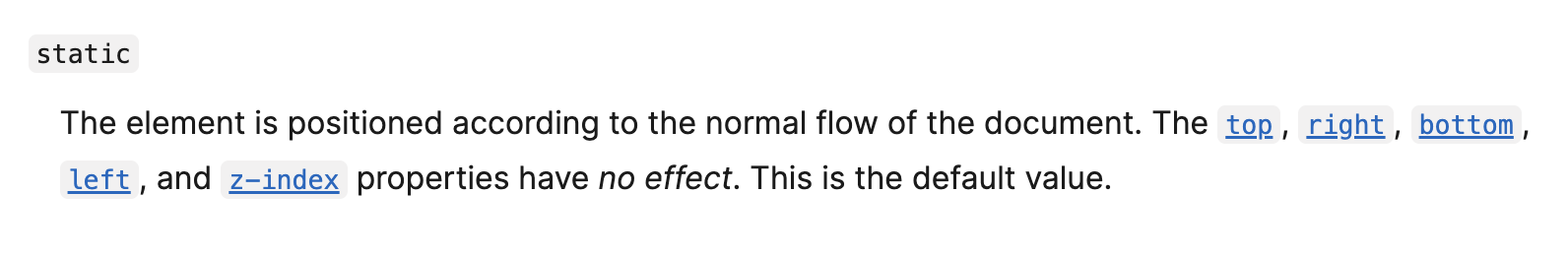
The default layout mode for most elements is called "flow".
z-index isn't implemented in the "flow" layout mode.
The MDN docs call this out in the position: static area which is the default for elements.
But it is implemented in "positioned" layout mode.
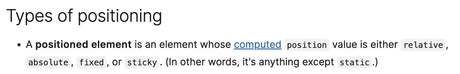
To enter positioned layout for an element, we can apply position: relative, position: absolute, position: fixed, or position: sticky
In this case, the easiest way to get z-index to work is to use position: relative.
<style>div {width: 100px;height: 100px;}.blue {position: relative;z-index: 5000;background-color: blue;}.red {position: relative;z-index: 4000;background-color: red;// Just to get both divs on top of each othermargin-top: -100px;}</style><div class="blue"></div><div class="red"></div>
Since both elements are in the "positioned" layout mode, z-index will work and the .blue div will be displayed on top.
You probably knew this without realizing it
If you've instinctively used gap only when you add display: flex or display: grid, you probably knew this without realizing it.
Why don't you just add gap without adding display: flex ?
Because gap isn't implemented in the default layout mode—flow.
But it is in the "flex" layout mode! Which you get when you do display: flex.
Some more quick examples
- Using
top,left,right,bottomonly works in "positioned" layout mode. - Margin collapsing only works in "flow" layout mode.
grid-template-areasonly works in "grid" layout mode.
Mistake 5: Using only grid or only flex
The final common mistake is overusing only display: grid or only display: flex.
Although many display: flex cases can use display: grid and vice-versa, each of these excel in their own areas.
CSS Grid is great for 2-dimensional layouts. I often see good CSS grid use cases when building a page-level layout structure.
For example, Una Kravetz shares how to build the classic holy grail layout using CSS Grid.
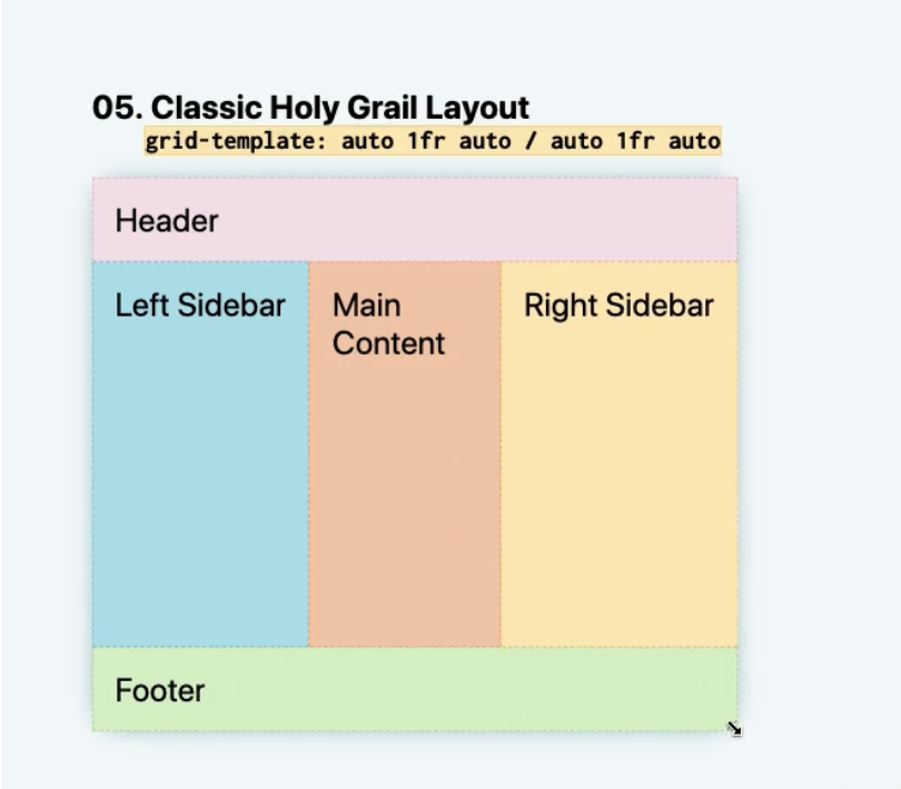
.parent {display: grid;grid-template: auto 1fr auto / auto 1fr auto;}header {grid-column: 1 / 4;}.left-side {grid-column: 1 / 2;}main {grid-column: 2 / 3;}.right-side {grid-column: 3 / 4;}footer {grid-column: 1 / 4;}
Flexbox is great for stacking items side by side or on top of each other in 1 dimension.
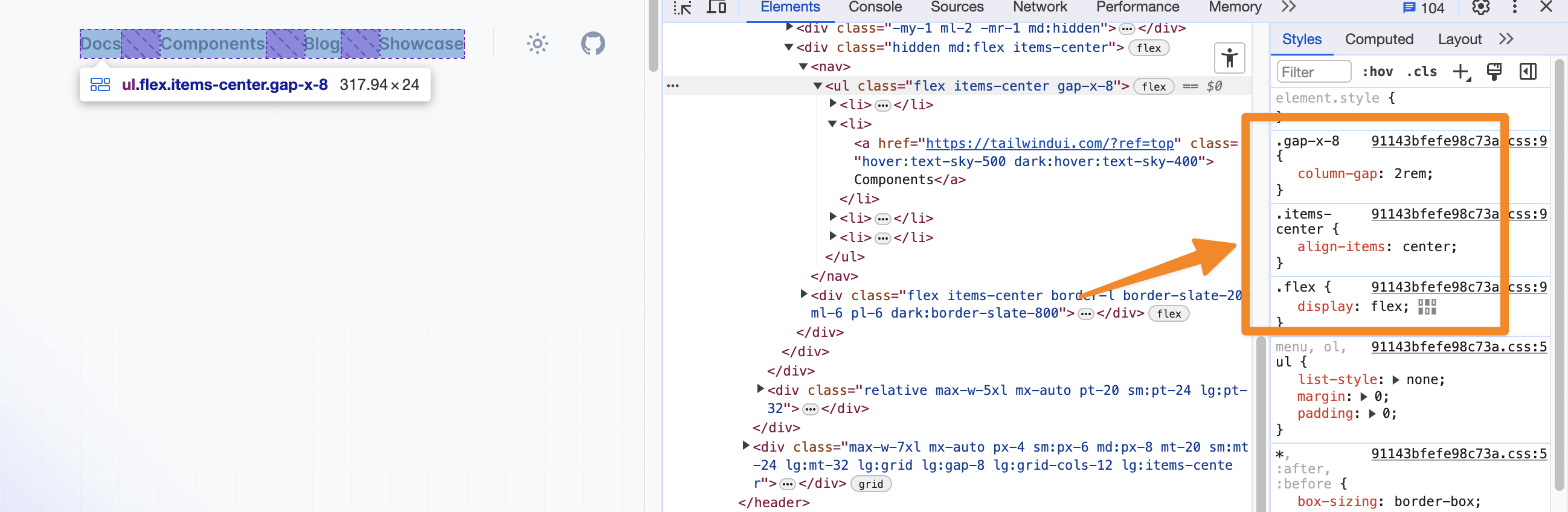
A great example of this is something like nav items that should be equally spaced apart.
Here is an example on Tailwind's home page.
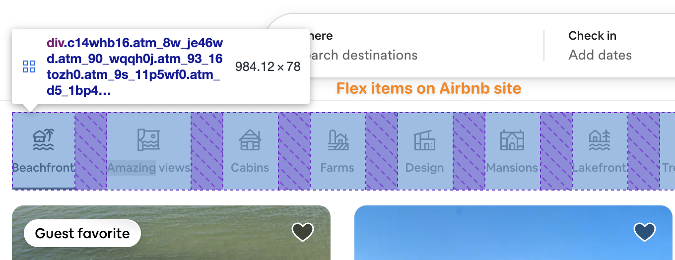
Here's one more example on Airbnb.
In general, I use Flexbox more than CSS Grid, but they both have their use cases and its important to use the correct one for your use case.
To learn more about Flexbox and CSS Grid on a fundamental level, I recommend Josh Comeau's Interactive Flexbox Guide and his Interactive CSS Grid Guide.
Conclusion
These are the top 5 CSS mistakes I've seen in my experience, but I'm sure there are others we can all learn from.
If you have other mistakes you see the most, feel free to drop me a DM on LinkedIn.
You can also check out my newsletter, High Growth Engineer, where I share how to grow faster as a software engineer to 50k+ engineers weekly.
See you there!