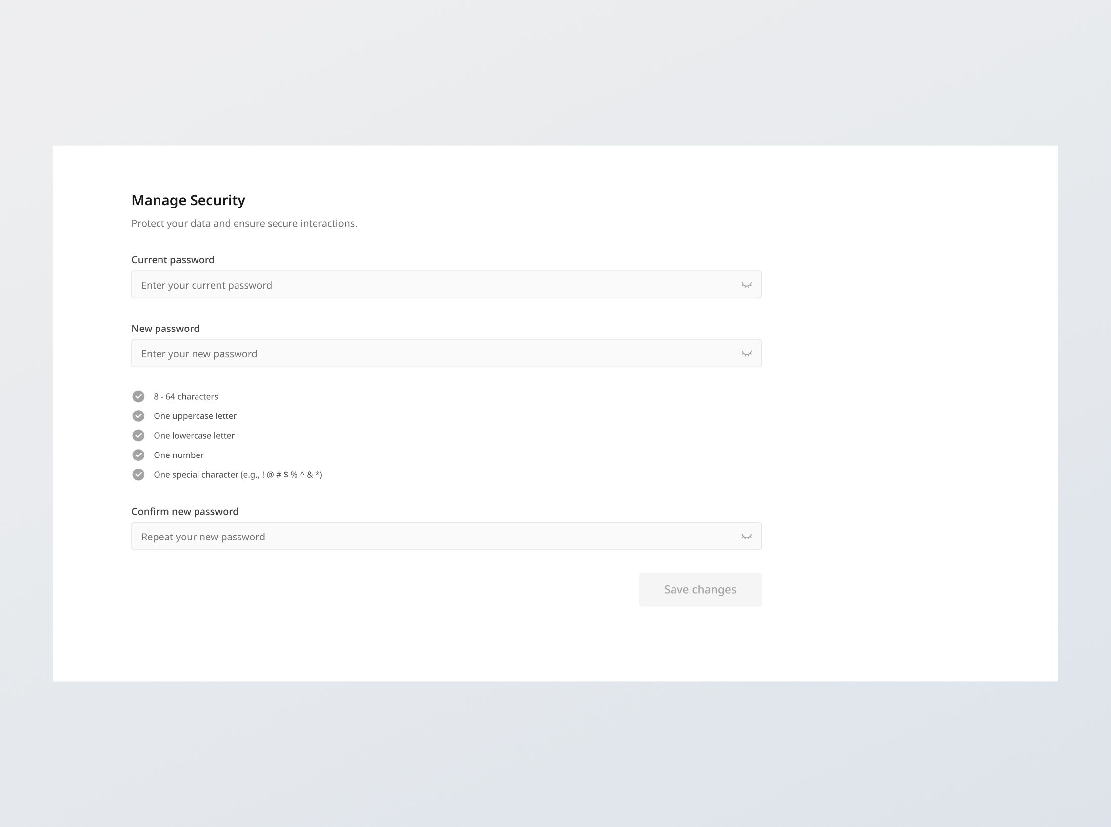
Password Section
+300 rep
Loading...
Get started
While working on project
After completion
1/3
Project brief
In this challenge, you are tasked with developing a responsive interface that enables users to update their password. It should include the following features:
- Change password form: Provide fields for users to input their current password and set a new one.
- Real-time validation: Provide immediate feedback on password complexity requirements as the user types.
- Password visibility toggle: Include an option to toggle the visibility of password inputs.
- [Stretch] API Integration: Integrate with a given API to validate current password and transmit new passwords to the server, or create your own endpoints to interact with the given data
This challenge has some overlap with Sign in / Sign up. If you've done the challenge, you might be able to reuse some components here.
Functional Requirements
1. Password fields
- Masking: Password fields should mask the password input by default.
- Visibility toggle: It should also include a visibility toggle icon that switches the display of the password between masked and plain text.
- Required: On submission, the fields should not be empty - "[fieldname] is required".
2. Current password field
- Validate that the current password matches stored credentials associated with the user in the database. Else, display the error message: "Sorry, the password that you have provided is incorrect".
3. New password field
- Real-time complexity check: Validate the entered password matches these requirements in real time, checking off each one:
- Criteria:
- 8 - 64 characters
- At least one uppercase letter
- At least one lowercase letter
- At least one number
- At least one special character (e.g., ! @ # $ % ^ & *)
- Criteria:
- Check icons: Implement check icons in active and normal states. When a password requirement is met, the icon should be switched from normal to active state.
- Validation:
- On submission, if complexity requirements are not met → "Password should contain [criteria (lowercase)]"
- On submission, if the authentication check is passed (current password is correct) check that the new password should not be the same as the current password. Else, give the error message: "New password is the same as the current password."
4. Confirm new password field
- Upon field filled and blurred, validate if it matches the 'New password' field.
- Provide a positive visual cue if matching; else, provide a negative visual cue
5. Form submission
- [Stretch goal] Populate database: Design a database schema and populate a database with the given dummy data.
- [Stretch goal] Create your own endpoints: Build your own endpoints based on the provided or created database schema to fetch data, conduct validation and save preferences.
- API integration: Use the provided or created endpoints to fetch data, conduct validation and save preferences.
- Ensure validation passed: On clicking "Save changes", conduct field validation based on the previously mentioned criteria once more. If there are errors, show them all at once, with focus on the first field with an error
- Submission: On clicking "Save changes" and successful client side validation of all fields, the form should submit the data to the API endpoint (provided or self-created), handling responses and errors gracefully:
- Success feedback: Provide success feedback with "Changes saved successfully"
- Error response: Handle any API error responses (e.g., 400 Bad Request, 500 Internal Server Error) by displaying an appropriate message such as "Unexpected error. Please try again later or contact support.".
6. State persistence
- On loading the settings page, the fields should reflect the current user settings fetched from the back end.
7. Error states
- Data fetch error: Show an empty state message titled "Unexpected error" with the description "We're facing some issues at the moment. Please try again later or contact support."
General requirements
- Design fidelity: Aim to follow the design as closely as possible. All elements in the design should be present, using the specified text color, font size, font weight, spacing, dimensions, etc.
- Interactivity:
- Toast notification: This component is used for displaying error messages when it is not specific to any input field
- Link / Button states: Implement and style links and buttons to reflect different states - normal, hover, focus and disabled.
- Input field states: Implement and style input fields to reflect different states - normal, focus filled, disabled, error, error filled, error focused.
- Cross-browser compatibility: Check that your solution works for major browsers including Chrome, Firefox, and Safari.
- [Stretch goal] Performance optimization: Code for fast load times with efficient CSS and JavaScript techniques.
- [Stretch goal] Accessibility and semantics: Follow best practices for web accessibility, such as using semantic HTML and ARIA roles where necessary and using proper
alttags for images.
1/3
Resources provided
Design files for desktop, tablet and mobile
High resolution image assets
README file
Starter code with content copy
Style guide for typography, colors and spacing
API specifications and sample data
Support you can expect
Official guides & resources
Development guides written & curated by Sr engineers at Big tech, such as:
Learn from good code
We recommend well-rated submissions using the same stack for your reference

Ask any questions in community
Have any doubts or need help? Ask in the community and discuss with others.