Get started
While working on project
After completion
1/3
Project brief
In this challenge, you will develop a responsive featured collections section based on the supplied designs, which have been adapted for desktop, tablet and mobile views.
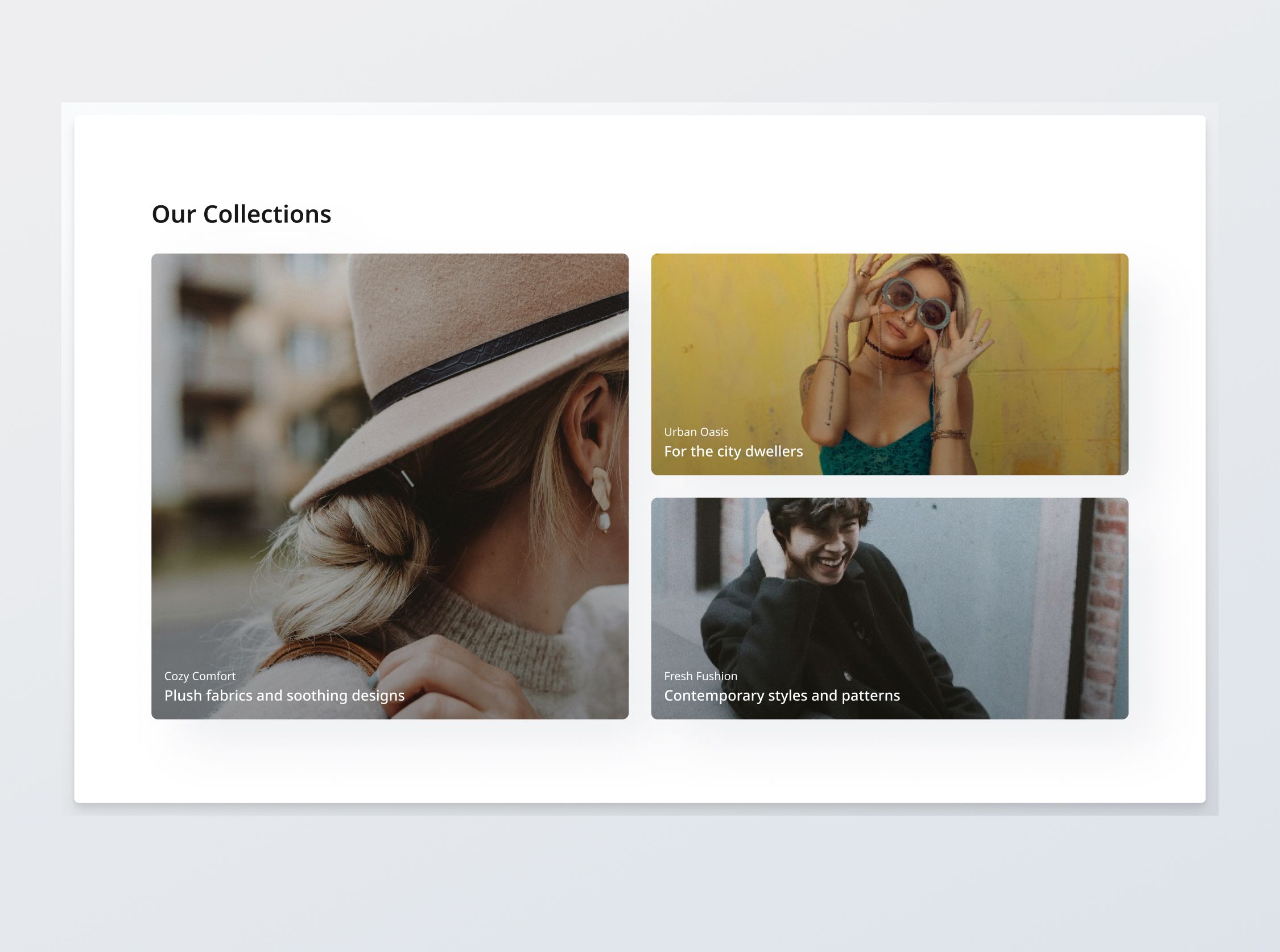
This section is a grid that displays the 3 collections on the e-commerce platform. It should be built to be dynamic, displaying up to 3 collections fetched from an API, each with a collection name, description and featured image as the background.
You will be provided with data pertaining to 3 featured collections to display in this section. To complete the functionality of this page, you should build the Product Listing Section, and filter by the relevant collection if the user clicks on the collection's card.
Implementation requirements
Collection cards
- 2 variants: Implement collection cards in "Primary" and "Secondary" variants. The ratios of these cards are specific to the viewport width; the "Primary" cards are squarish on desktop, but are tall and rectangular on tablet. The first collection will be "Primary" and the others will be "Secondary".
- States: Implement and style collection cards to reflect different states - normal, hover, and focus.
- Modularity and configurability: The component should be built to be reusable and modular, displaying up to 3 collections, each with a collection name, featured image and short collection description.
General requirements
- Design fidelity: Aim to follow the design as closely as possible. All elements in the design should be present, using the specified text color, font size, font weight, spacing, dimensions, etc.
- Responsive behavior:
- Text size: Should be responsive; font size is larger for wider devices, smaller for narrow devices.
- Responsive layout: The content should stack vertically on smaller screens and align horizontally as the screen width increases.
- Placeholders: You may leave the redirection links empty for any unspecified buttons or links.
- Cross-browser compatibility: Check that your solution works for major browsers including Chrome, Firefox, and Safari.
- [Stretch goal] Performance optimization: Code for fast load times with efficient CSS and JavaScript techniques.
- [Stretch goal] Accessibility and semantics: Follow best practices for web accessibility, such as using semantic HTML and ARIA roles where necessary and using proper
alttags for images.
1/3
Resources provided
Design files for desktop, tablet and mobile
High resolution image assets
README file
Starter code with content copy
Style guide for typography, colors and spacing
API specifications and sample data
Support you can expect
Official guides & resources
Development guides written & curated by Sr engineers at Big tech, such as:
Learn from good code
We recommend well-rated submissions using the same stack for your reference

Ask any questions in community
Have any doubts or need help? Ask in the community and discuss with others.