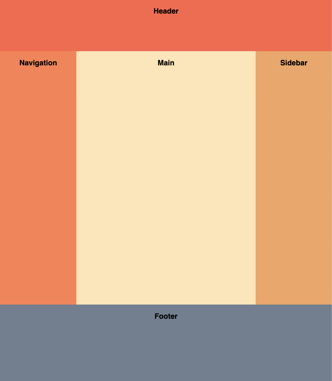
The Holy Grail layout is a famous CSS page layout that has traditionally been hard to implement. It consists of a header, footer, and three columns. The left column contains navigation items, the middle column contains the page contents, and the right column contains ads.
Implement the Holy Grail layout using just CSS. You shouldn't need to change the HTML too much.
Requirements
- Header
- Stretches horizontally across the whole page.
- 60px tall.
- Columns
- Both the left and right columns have a fixed width of 100px.
- The center column is fluid-width.
- All the columns should have the same height, regardless of which column is the tallest.
- Footer
- Stretches horizontally across the whole page.
- 100px tall.
- The footer should be at the bottom of the page even if there is not enough content to fill up the viewport height.
Asked at these companies
Solution
There are two idiomatic ways to build the Holy Grail layout with modern CSS: Flexbox and Grid. Both have full support in every evergreen browser. Flexbox is what most older interview answers show. Grid is the more idiomatic modern approach because the layout shape is declared visibly with named areas. Either is a correct answer in an interview, and being able to discuss the tradeoff between the two is a strong follow-up signal.
Approach 1: Flexbox
Two nested flex containers do the work: the outer container stacks the page vertically (header / columns / footer), and an inner container lays the three columns out horizontally.
Sticky footer
The Holy Grail layout problem also encompasses another classic problem: making a footer stick to the bottom of the screen when there is not enough content to fill up the page.
This can be solved by adding min-height: 100vh to the container of the page's contents. Since the direct children will be laid out in a vertical fashion, we add display: flex and flex-direction: column to that element as well.
The header and footer are fixed heights, and the columns are variable height and meant to fill up any remaining space. To achieve this, flex-grow: 1 is added to the <div> wrapping the columns.
Columns
The requirement to make all the columns equal-height is also trivially solved with Flexbox. By adding display: flex to the div wrapper of the columns, this requirement is met.
Like before, the flexible-width <main> content section can be achieved using flex-grow: 1 and it will fill up any horizontal space available.
flex-shrink: 0 has to be added to <nav> and <aside> so that they don't shrink when the content in <main> is too wide.
Approach 2: CSS Grid
CSS Grid expresses the layout shape directly with grid-template-areas, which makes the structure of the page readable at a glance. It also collapses the two nested containers from the Flexbox approach into a single grid container.
.layout {display: grid;min-height: 100vh;grid-template-areas:'header header header''nav main aside''footer footer footer';grid-template-rows: auto 1fr auto;grid-template-columns: 100px 1fr 100px;}header {grid-area: header;}nav {grid-area: nav;}main {grid-area: main;}aside {grid-area: aside;}footer {grid-area: footer;}
A few things worth calling out:
grid-template-rows: auto 1fr automakes the header and footer hug their content while the middle row takes the remaining space. This is what gives the sticky-footer behavior without a separate flex wrapper.min-height: 100vhensures the layout fills at least the viewport on short pages.- The named areas in
grid-template-areasliterally draw the layout, which is why this version reads more naturally than the equivalent Flexbox markup.
Flexbox vs Grid: which to use?
| Property | Flexbox | CSS Grid |
|---|---|---|
| Markup | Two nested containers (column wrapper + row wrapper). | Single container; children declare which area they fill. |
| Layout intent | Implied by source order. | Declared visibly via named areas. |
| Sticky footer | Requires flex-direction: column + flex-grow on the columns wrapper. | Falls out of grid-template-rows: auto 1fr auto. |
| When to pick it | Small components, single-axis layouts, codebases that already use Flexbox throughout. | Page-level layouts, when you want layout intent visible in CSS, or when columns need to swap rows on smaller screens. |
Both are correct interview answers. Showing both, or picking Grid and explaining the reason, sends a stronger signal than producing only the Flexbox version.
Common mistakes
These come up often when implementing Holy Grail under interview time pressure:
- Using
height: 100vhinstead ofmin-height: 100vh.heightclips the layout when content exceeds the viewport.min-heightlets the layout grow past 100vh on long pages while still filling short ones. - Forgetting
flex-shrink: 0on the sidebars (Flexbox only). Without it, the fixed-width sidebars compress when the main column is wide, and the layout looks broken. - Forgetting
grid-template-rows: auto 1fr auto(Grid only). Without1fron the middle row, the columns row collapses to its content height and the footer rides up. - Putting
min-height: 100vhon the wrong element. It belongs on the layout container, which is the element that hasdisplay: flexordisplay: grid. Putting it onbodyalone is not enough if a wrapper element sits in between. - Treating the header/footer as flex/grid items but forgetting they need a fixed height per the spec (60px and 100px respectively).
Responsive Holy Grail (follow-up)
Interviewers often follow up with "now make it responsive". On narrow screens, the three columns should stack vertically. With Grid, a single media query swaps the template:
@media (max-width: 768px) {.layout {grid-template-areas:'header''nav''main''aside''footer';grid-template-columns: 1fr;}}
The named areas reorder cleanly without changing any element's grid-area declaration. With Flexbox, the same change requires switching flex-direction on the columns wrapper and resetting the sidebar widths. Workable, but more verbose.
Test cases
- Test variable width: the navigation and sidebar columns should be fixed width and the middle column is fluid and fills up any remaining space.
- Test variable height: the header and footer rows should be fixed height and the footer should always be at the bottom of the window.
- Test lots of content within
main. It should not cause thenavandasideto shrink.
Notes
- There are multiple ways to implement the Holy Grail layout. It'd be good practice to try out a Grid-based approach as well, as it might become the de facto solution in the future.
<!doctype html><html><head><meta charset="utf-8" /><meta http-equiv="X-UA-Compatible" content="IE=edge" /><meta name="viewport" content="width=device-width,initial-scale=1.0" /><title>Vue</title></head><body><div id="app"></div><!-- Built files will be auto injected --></body></html>
You must be signed in to view your saved versions
Loading editor
Loading editor
JavaScript Console
console.log() statements will appear here.