Loading workspace…
Holy Grail
Yangshun TayEx-Meta Staff Engineer
Languages
The Holy Grail layout divides a page into a full-width header and footer around three columns: navigation on the left, main content in the center, and supporting content such as ads on the right. This structure appears in content-heavy sites and dashboards.
The challenge is making the regions respond to one another: the sidebars keep their widths, the main column absorbs available space, and the footer stays at the bottom of short pages without overlapping longer content.
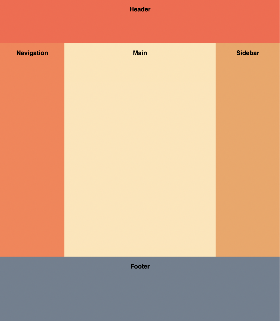
Implement the Holy Grail layout using just CSS. You shouldn't need to change the HTML too much.
Requirements
- Header
- Stretches horizontally across the whole page.
- 60px tall.
- Columns
- Both the left and right columns have a fixed width of 100px.
- The center column is fluid-width.
- All the columns should have the same height, regardless of which column is the tallest.
- Footer
- Stretches horizontally across the whole page.
- 100px tall.
- The footer should be at the bottom of the page even if there is not enough content to fill the viewport height.