• edited
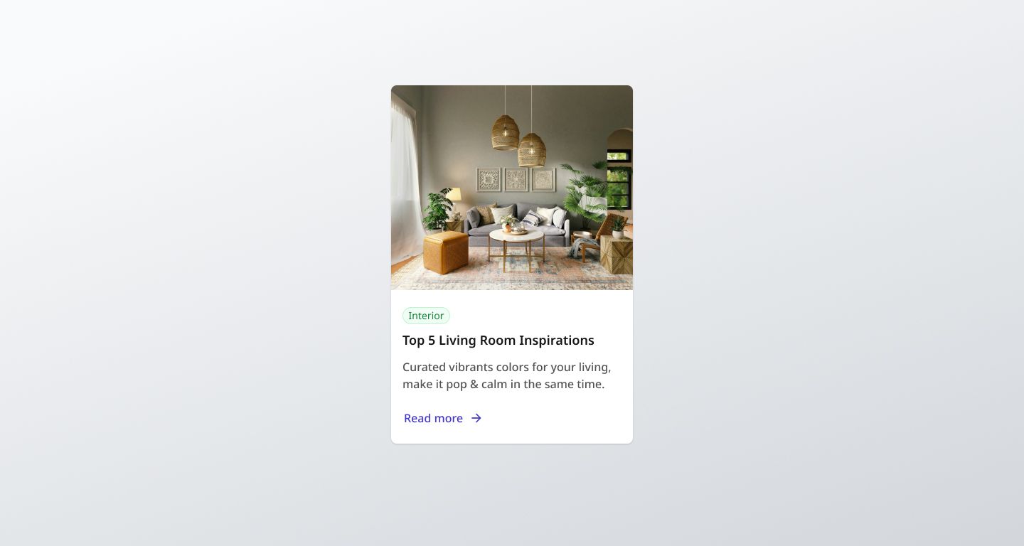
Blog Card with Astro & Tailwind
53
9
Power Platform Consultant @ ANS
6 YOE
1.3k Reputation
Implementation details
Tech stack and approach
I used Astro and Tailwind as this is the stack I want to master. I used the principle of having the heading and text of the card above the image in the DOM and then just changing the order with CSS as outlined in Inclusive Components
Useful resources and lessons learnt
https://inclusive-components.design/cards/
https://www.astroicon.dev/getting-started/
https://fontsource.org/fonts/noto-sans/install
Notes/questions for community
- Don't forget the custom font!
- I tried using the Astro Icon component and passing this to the BlogCard Component in a slot but I had issues with getting the icon to honor styling when the button is disabled so switched back to having the SVG code in the BlogCard Component and styled it as follows:
<style>
  button * {
    color: #4f46e5;
  }
  button:hover * {
    color: #3730a3;
  }
  button:disabled * {
    color: #a3a3a3;
  }
</style>
I'd be interested to see if anybody can get Astro Icon working with disabled states etc as I'm assuming that I was the problem in this situation (as usual 😂).
Tech stack
HTML
Basics
Semantics
Images
CSSBasics
Positioning
Layout
Responsive Design
Astro
Tailwind
Code
Loading...
Discussions
Loading...